.png)
Kubernetes (K8s) Utilization Overview
This dashboard provides a complete view of your Kubernetes utilization across clusters, nodes, namespaces, and locations. It helps you track CPU, memory, and storage utilization over time, identify under- or over-utilized resources, and uncover optimization opportunities. Interactive charts, detailed tables, geo views, and flexible filters make it easy to analyze trends, monitor efficiency, and improve resource planning.
Why this matters: cost and utilization are two sides of the same coin — the K8s Cost pages tell you what you're paying for, this page tells you whether you're actually using it. A cluster can look cost-efficient on paper while running at 20% CPU utilization; this is where that gets caught, before it turns into a rightsizing conversation nobody saw coming.
Key Metrics
Utilization Score
The utilization score widget shows the percentage of Total Kubernetes utilization score for the selected Kubernetes. This allows you to see the extent to which you are using your Kubernetes and how much of your Kubernetes commitment has been fulfilled. This can help you understand the effectiveness of your Kubernetes usage and identify any opportunities for optimization.
CPU Utilization
The CPU utilization widget shows the percentage of Total Kubernetes CPU utilization for the selected period. This allows you to see the extent to which you are using your Kubernetes and how much of your Kubernetes commitment has been fulfilled. This can help you understand the effectiveness of your Kubernetes usage and identify any opportunities for optimization.
Memory Utilization
The Memory utilization widget shows the percentage of Total Kubernetes memory utilization for the selected period. This allows you to see the extent to which you are using your Kubernetes and how much of your Kubernetes commitment has been fulfilled. This can help you understand the effectiveness of your Kubernetes usage and identify any opportunities for optimization.
Storage Utilization
The Storage Utilization widget shows the percentage of Total Kubernetes storage utilization for the selected period. This allows you to see the extent to which you are using your Kubernetes and how much of your Kubernetes commitment has been fulfilled. This can help you understand the effectiveness of your Kubernetes usage and identify any opportunities for optimization.

Dashboard Views
Utilization Chart
The Utilization Chart presents a graphical representation of the used and unused hours for each month. You can hover your mouse over the chart to view the used and unused hours, as well as the utilization percentage for each month. When you click on a bar in the chart, the Kubernetes Widgets, Geo Chart, and utilization items will display data accordingly.
You can expand or restore the view of the Utilization Chart by clicking the square icon. Additionally, you can download the chart by clicking the download icon. This can help you understand the distribution of your Kubernetes usage over time and identify any trends or patterns.
Use the Category selector to switch the chart between Compute and Storage utilization, and the Y-Axis selector to pick the specific metric to plot within that Category — for example, CPU Utilization or Memory Utilization under Compute. This also determines which columns are relevant in the K8s Utilization Items table below.
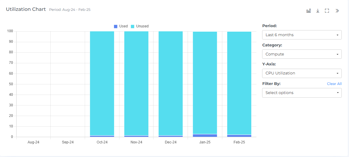
The Utilization Chart allows you to switch between different chart types, such as bar charts and line charts, to visualize the data in different ways. This feature allows you to choose the chart type that best represents the data and helps you understand your Kubernetes usage more effectively.
The Utilization Chart allows you to filter the data using various options. For example, you can filter the data by node or cluster or volume etc to narrow down the data and focus on specific aspects of your usage. This can help you better understand and analyze your Kubernetes usage.
When you click on a specific bar in the Utilization Chart, the Items will display the associated Kubernetes for that particular item.
Geo Chart
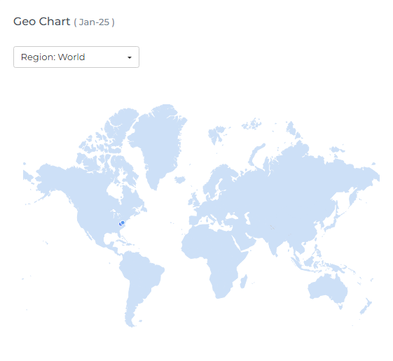
The Kubernetes Geo Chart displays the data points for the selected month, showing the number of Kubernetes in each region. You can hover your mouse over the data points to view the region name and the number of Kubernetes in that region.
The maroon color indicates a higher level of Kubernetes usage in that particular location. If there are two data points that overlap, a small magnifying glass icon is displayed.
You can use the drop-down menus to change the host and month, allowing you to view data from different regions and months. This can help you understand the geographical distribution of your Kubernetes usage and identify any trends or patterns.
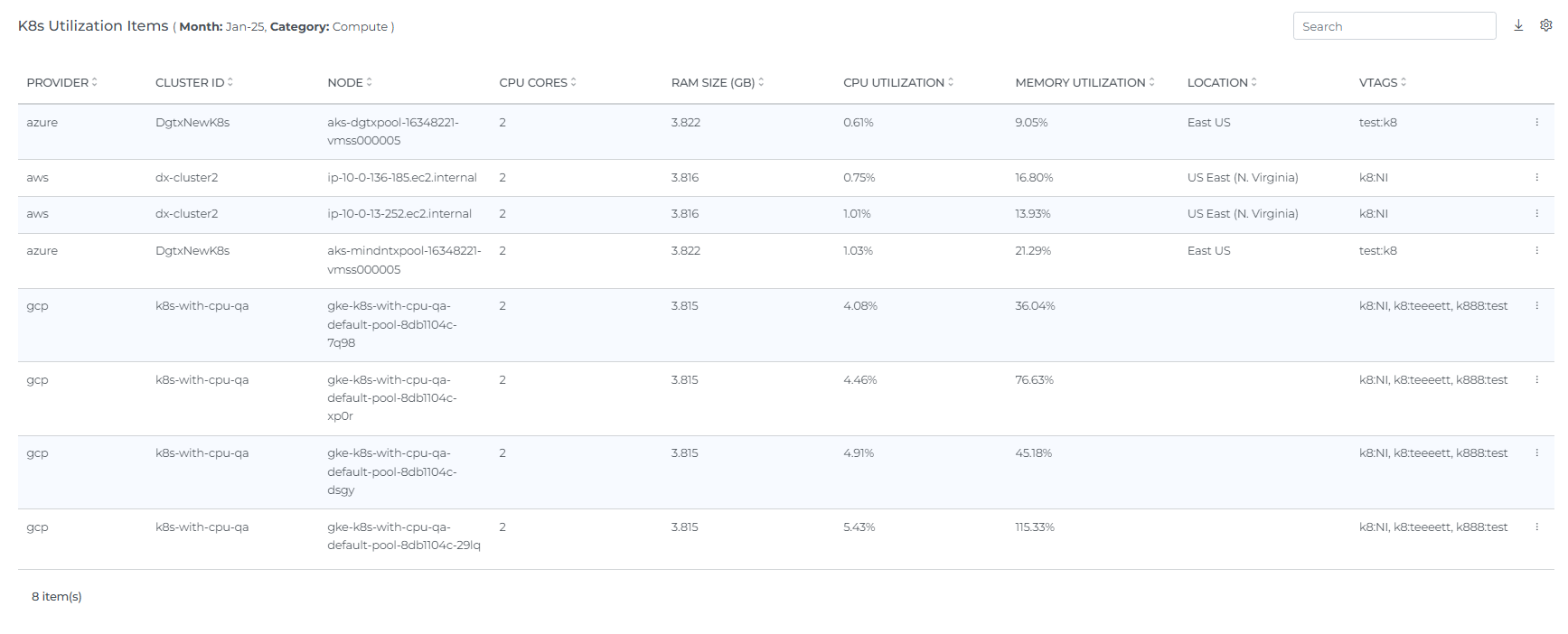
Utilization Items
The K8s Utilization Items table lists every node for the selected month and Category, with columns for Provider, Cluster ID, Node, Location, CPU Cores, RAM Size (GB), CPU Utilization, Memory Utilization, and vTags. This gives you the full per-node detail behind the summary widgets and chart above.
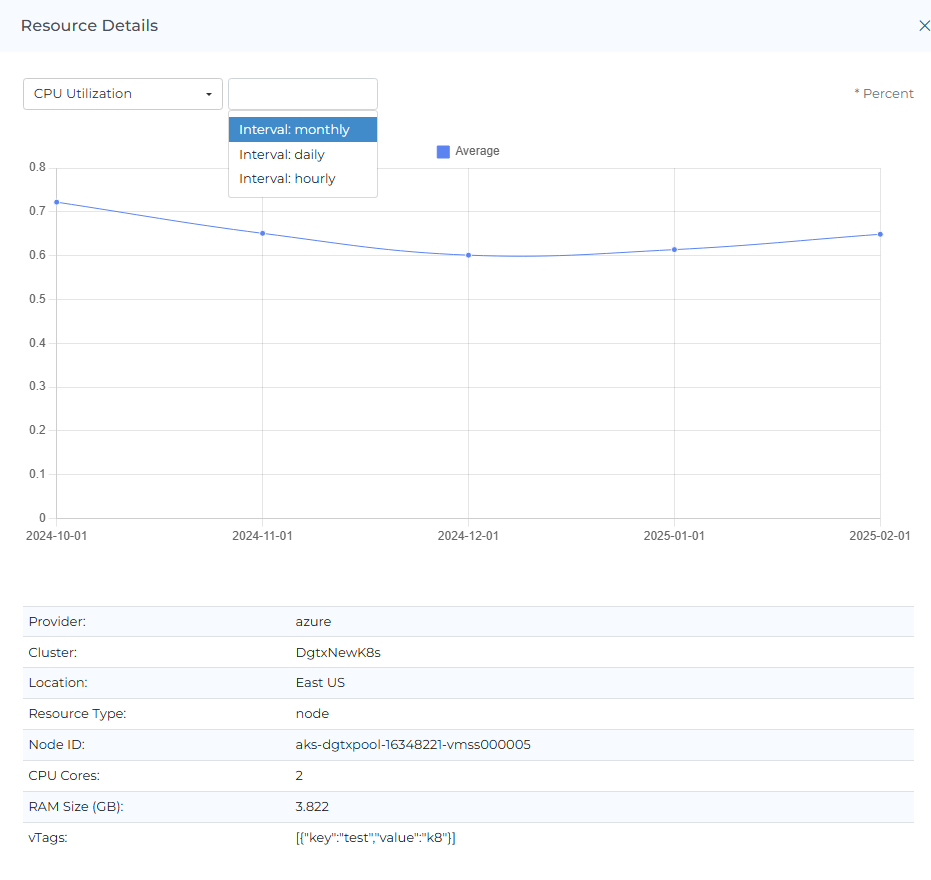
Click the View Details icon on a row to open the Resource Details panel, showing the node's metadata (provider, cluster, location, resource type, node ID, capacity, CPU cores, RAM size) together with its usage metrics chart in the same view.
The Utilization Items can be sorted, searched, and downloaded. You can also click on the settings icon to change the way the data is displayed. The number of Utilization Items displayed will depend on the selection you make in the settings. This can help you more easily analyze and understand your Kubernetes usage.
Actions and Filters
Header Icons

Share
If you click on the "share" link, a link to the current page will be copied to your clipboard. You can then share this link with other team members, allowing them to access the same data and filters as you. This can be useful for collaborating with others and sharing information about your Kubernetes Utilization page.
Bookmark
Click the Bookmark icon to save the current page's view, including your active filters, so you can return to it quickly later. You can access your saved bookmarks from your profile menu.
Subscription
Click the Subscription icon to set up a recurring email report of this page. See the Subscriptions page for full setup steps.
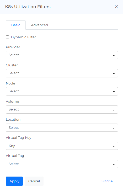
Kubernetes Utilization Filters
Basic
The filter option allows you to narrow down the data displayed on the page to specific criteria. You can use it to view utilization for a particular Provider, Cluster, Node, or Location. This can help you focus on specific aspects of your Kubernetes utilization to more effectively analyze and understand the data.
On selecting Dynamic Filter adjusts options based on previous selections. For example, choosing a Cluster will update subsequent filters (e.g., Node) to show only relevant data for that provider. This ensures efficient and context-sensitive filtering.
Advanced
The "Advanced Kubernetes Utilization Filters" feature use to apply detailed filters to refine search results. You can add multiple filters by selecting criteria like "Cluster," choosing an operator (e.g., "IN"), and selecting values from dropdown menus. The interface includes options to apply or cancel changes and a "Clear All" button to reset filters.
Cost Options
You can view costs by selecting different Cost Fields, such as Actual, Requested. Hover over each option to see its meaning.
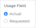
Actual: Actual usage tracks CPU, memory, GPU, and persistent volume (PV) storage consumption across Kubernetes nodes and volumes.
Requested: Requested usage shows how much of your reserved/requested capacity you actually used - helping you identify over-allocation and understand chargeable capacity.
Screenshot
If you click on the camera icon, you can take a screenshot of the current page and download it as a PDF file. This can be useful for saving a copy of the data or for sharing it with others.
Reload Option
The "reset" option allows you to clear all filters and selections from the page, returning it to the default view. This can be useful if you want to start over or view the data in its original form.
Info
The "last updated" date and time stamp show when the data on the page was last refreshed. This can be useful for understanding the age of the data and determining if it is up to date.
Help
If you click on the "?" icon, you can access the help documentation for the page. This can provide you with additional information and guidance on using the page and its features.
FAQs
What's the difference between "Actual" and "Requested" in Cost Options?
Actual tracks real CPU, memory, GPU, and storage consumption. Requested shows how much of your reserved capacity was actually used, which helps you spot over-allocation — resources requested but sitting unused.
Why would I check Utilization instead of just K8s Cost?
Cost tells you what you're paying; Utilization tells you whether that spend is actually being used. A cluster can look reasonably priced while running at low CPU/memory utilization — this page is where that gap becomes visible.
What's the difference between Category and the Y-Axis selector on the Utilization Chart?
Category (Compute or Storage) picks which pool of resources the chart and Utilization Items table cover. Y-Axis then picks the specific metric to plot within that pool.